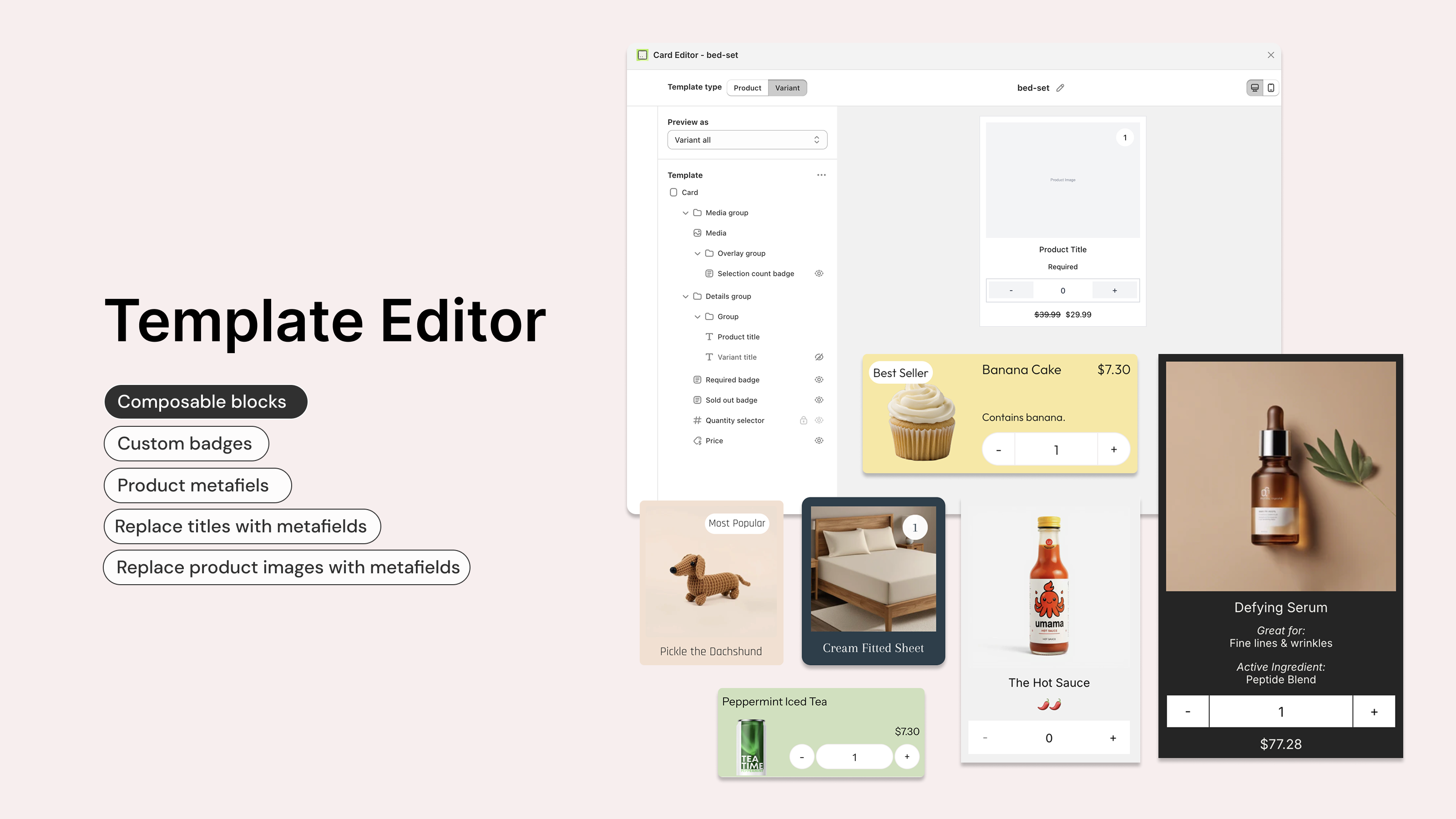
The Card Editor is a visual layout editor that lets you customise how product and variant cards appear inside your bundle form. You can control exactly what information is shown on each card, the order it appears in, and how it is arranged.
The Card Editor replaces the older "legacy" card styles (such as Portrait and Horizontal) with a flexible, drag-and-drop interface. It is available on all plans, with plan-based limits on how many custom templates you can create.
The Card Editor controls card layout (which components appear and how they are arranged).
Card styling (colours, borders, backgrounds, fonts) is still controlled in your Shopify theme editor under the Biscuits Bundle Builder block settings, because it inherits your theme's styles.
See Customise the look of your bundle form for more on theme styling.
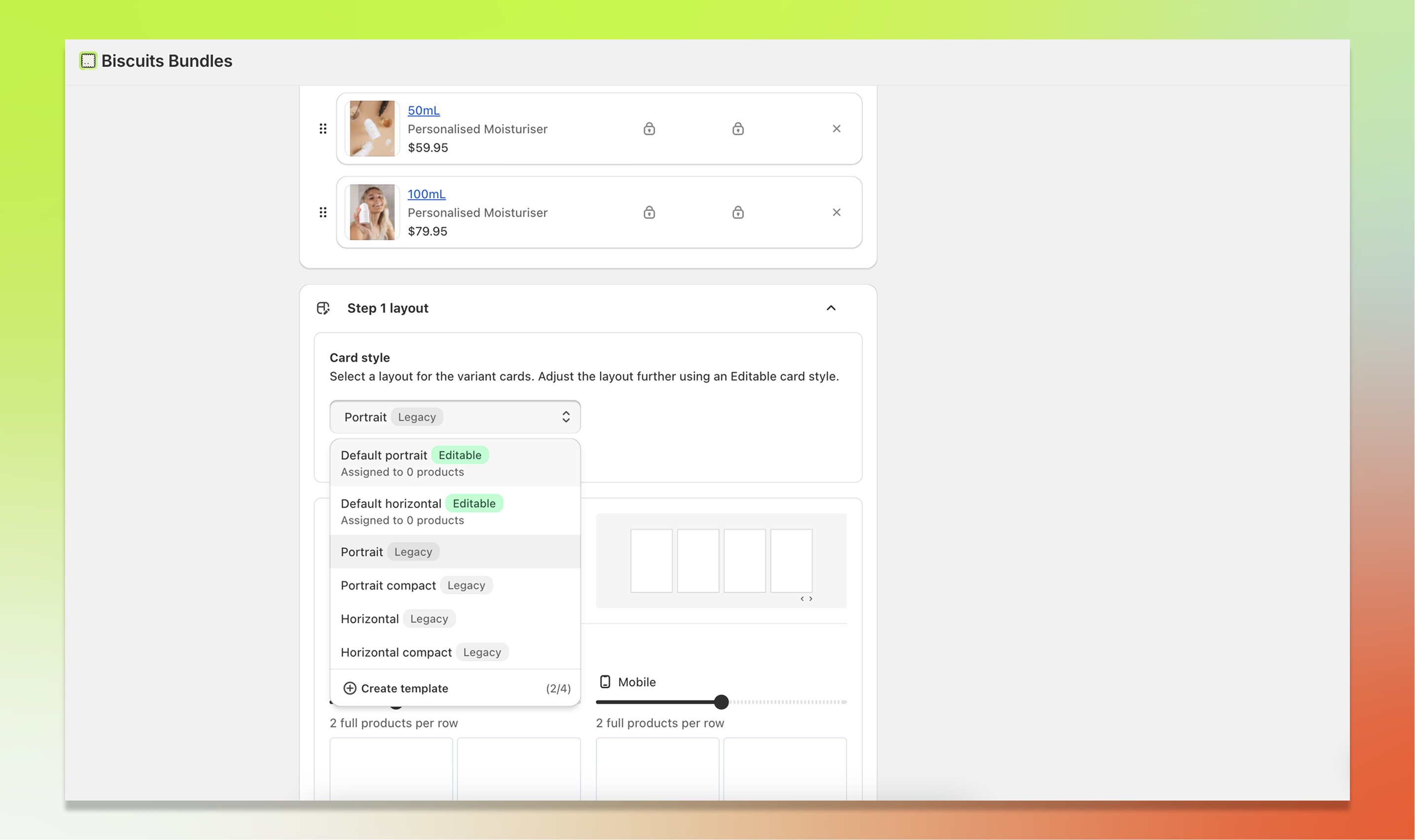
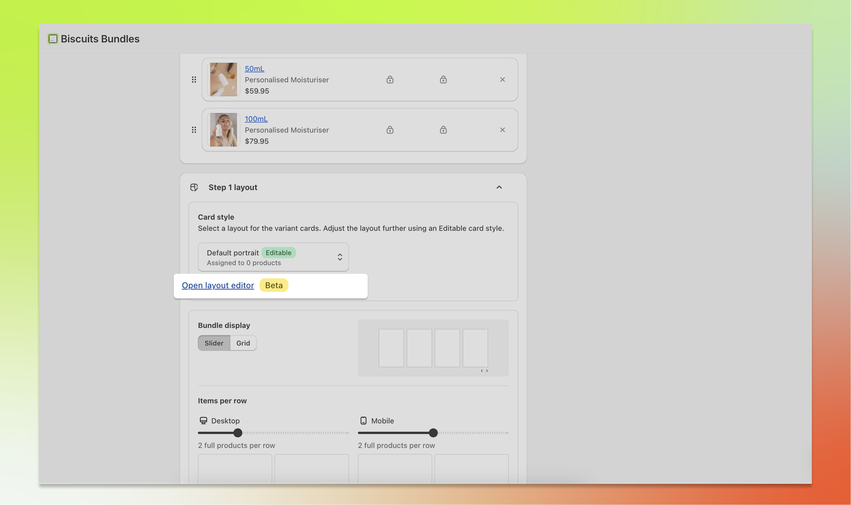
Inside your bundle, each step has a Card style section. This is where you choose which card template to use for that step's products.
Open the template selector dropdown and you will see two types of templates:
Editable templates are custom templates that you can open and modify in the layout editor. They are labelled with an "Editable" badge.
Legacy templates are the older built-in styles: Portrait, Horizontal, Portrait compact, and Horizontal compact. These cannot be opened in the layout editor.
Selecting a template applies it to that step's cards. You can use a different template on each step of the same bundle.
A bundles steps must use all Editable, or all Legacy card styles. It cannot use a mix of both. When changing a step between Legacy and Editable, all steps in the bundle will be updated to match.
You can create your own custom card templates or edit the default templates provided. Here's how:
Open the template selector dropdown on any bundle step.
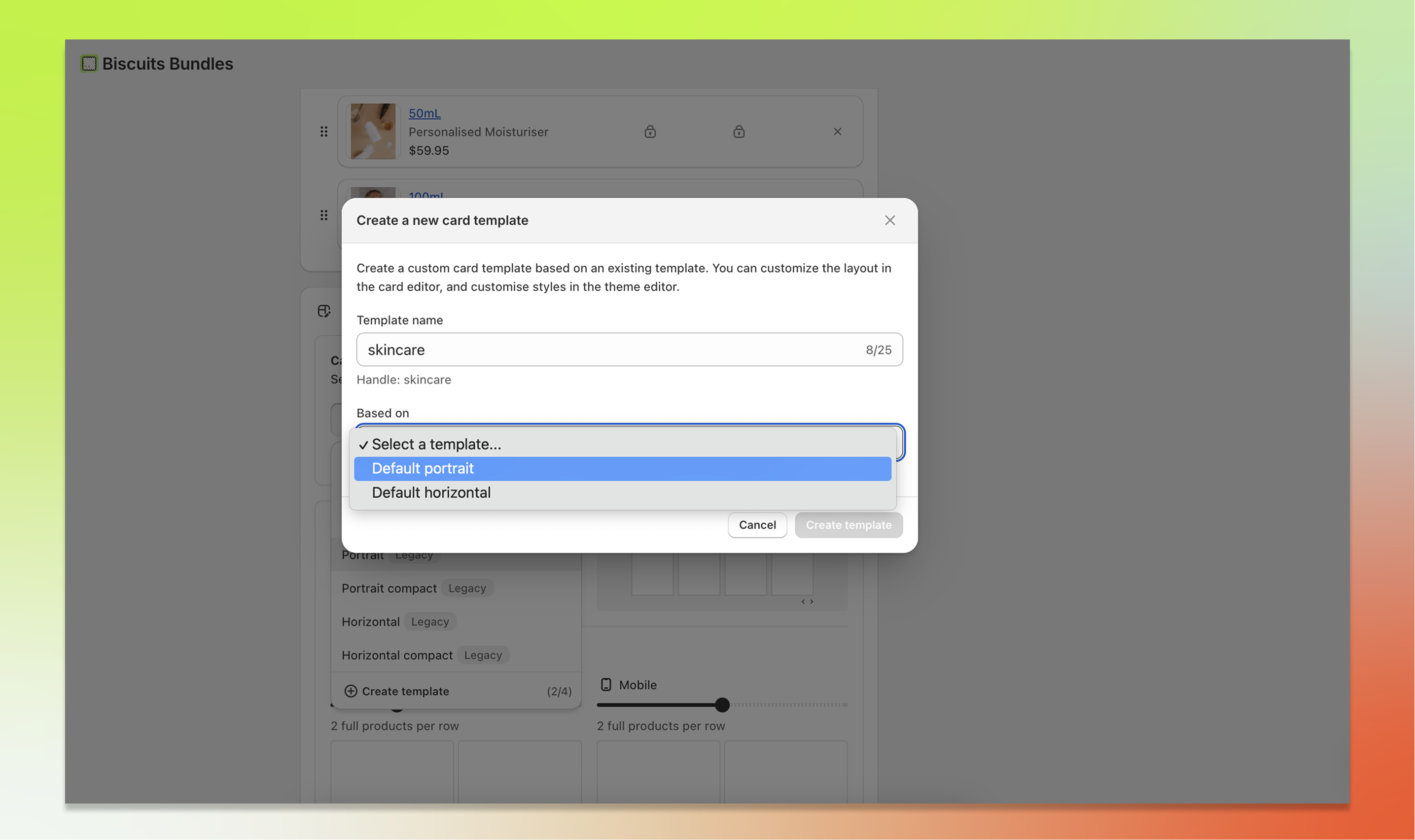
Click the "Create template" button at the bottom of the dropdown.
You'll see a usage counter next to it (e.g. "2/4") showing how many templates you've used out of your plan limit.
In the modal that appears, enter a template name.
Names can be up to 25 characters long and may contain letters, numbers, spaces, dashes, and underscores.
Then choose a base template from the "Based on" dropdown. This is the existing template whose layout your new template will start with.
Click Create template. Your new template is created and the layout editor opens automatically so you can start customising.
Your template name is used to generate a unique handle. For example, "My Custom Card" becomes my_custom_card. Each template handle must be unique across your store. You can edit the title's again later, but handles will never change.
To open the layout editor for an existing editable template:
Select an editable template from the template selector dropdown.
Click the "Open layout editor" link that appears below the selector.
The editor opens in a full-screen modal where you can make changes.
If the link appears greyed out with a tooltip, it means you have a legacy template selected. Legacy templates cannot be edited in the Card Editor. Select or create an editable template first.
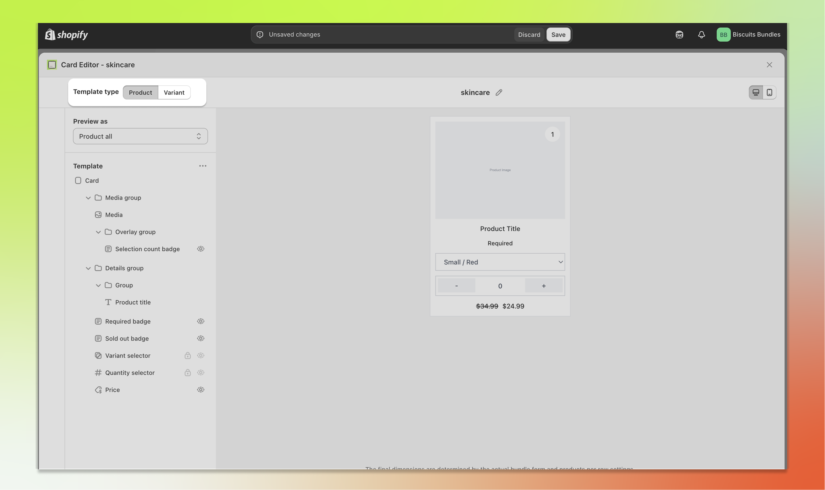
The Card Editor is modelled on the Shopify theme editor and has three main areas:
Header: Contains the Product / Variant template type toggle, the template name, and the desktop/mobile viewport switcher.
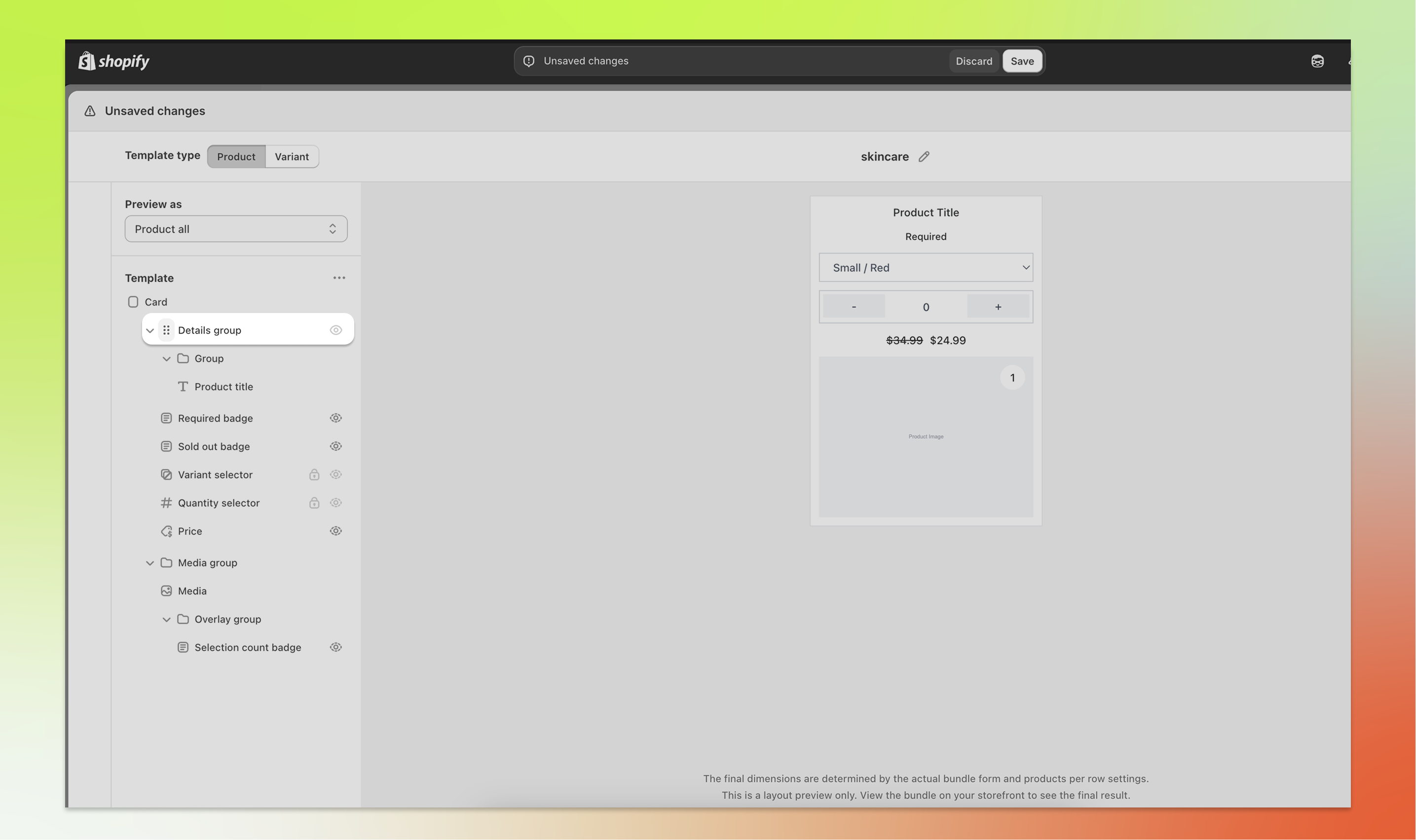
Component tree (left panel): A hierarchical list of all the building blocks that make up your card. This is where you add, remove, reorder, and configure components.
Preview (right panel): A live preview of the layout of the card. It updates in real time as you make changes.
When you click on a component in the tree, its settings panel appears, allowing you to configure that component.
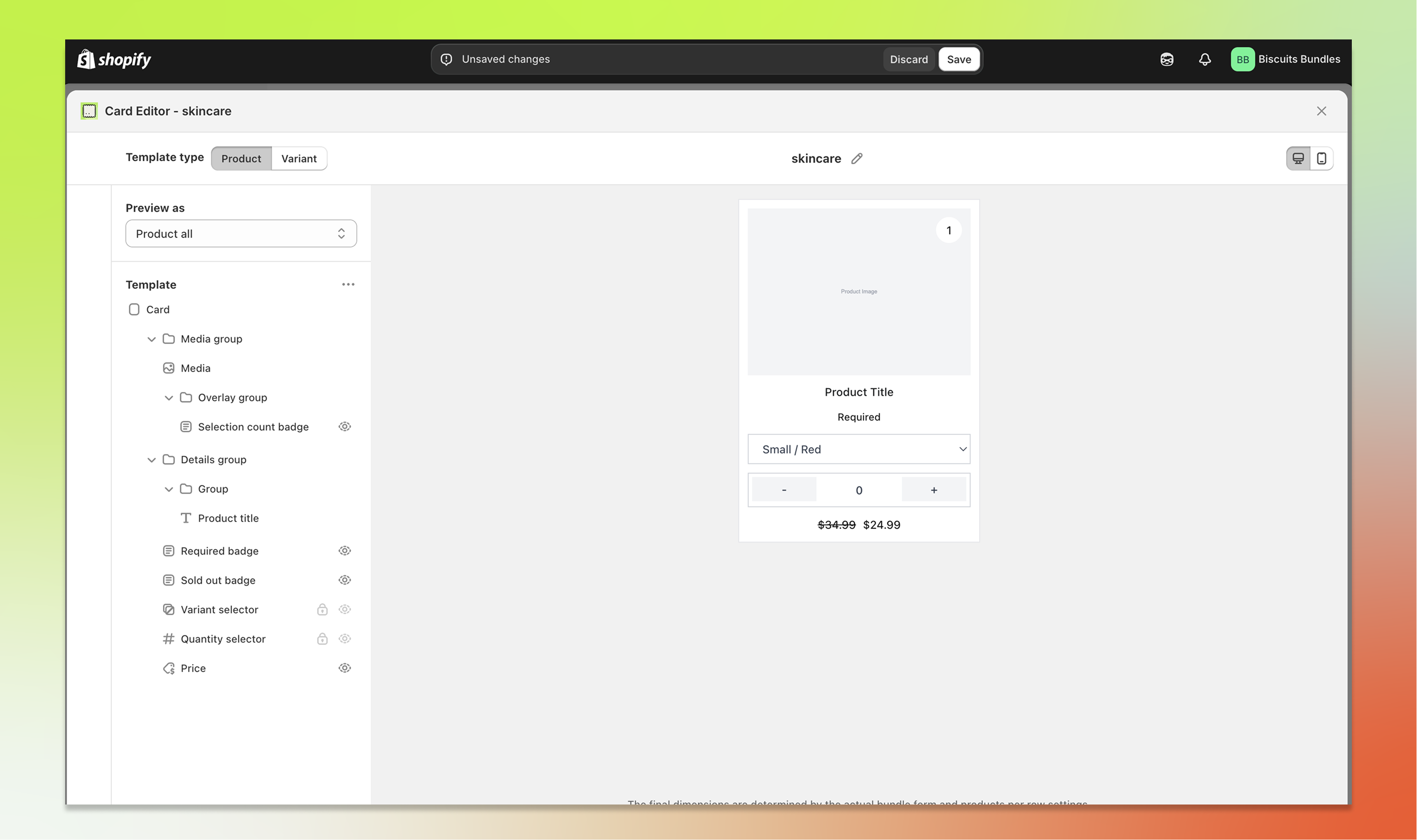
Each card template contains two separate layouts: a Product template and a Variant template. You can edit each one independently.
Use the Product / Variant segmented toggle in the header to switch between them.
The component tree and preview will update to show the selected template type.
Which template is used on your storefront depends on the Display type setting on your bundle step:
If a step is set to product level, the Product template is used.
If a step is set to variant level, the Variant template is used.
Adding components: Click the "+" button that appears between components in the tree. A menu will appear listing the available component types you can add. Some components can only be added once per template, so the menu only shows components that haven't reached their limit.
Removing components: Hover over a component in the tree and click the delete icon to remove it. Note that some core components (such as Card, Media, and Variant selector) cannot be deleted because they are essential to the card's functionality.
Reordering components: Drag and drop components in the tree to change their order. Grab a component by its drag handle and move it up or down to the desired position.
Showing and hiding components: Toggle a component's visibility using the eye icon. Hidden components are greyed out in the tree and removed from the live preview, but they remain in your template so you can re-enable them later.
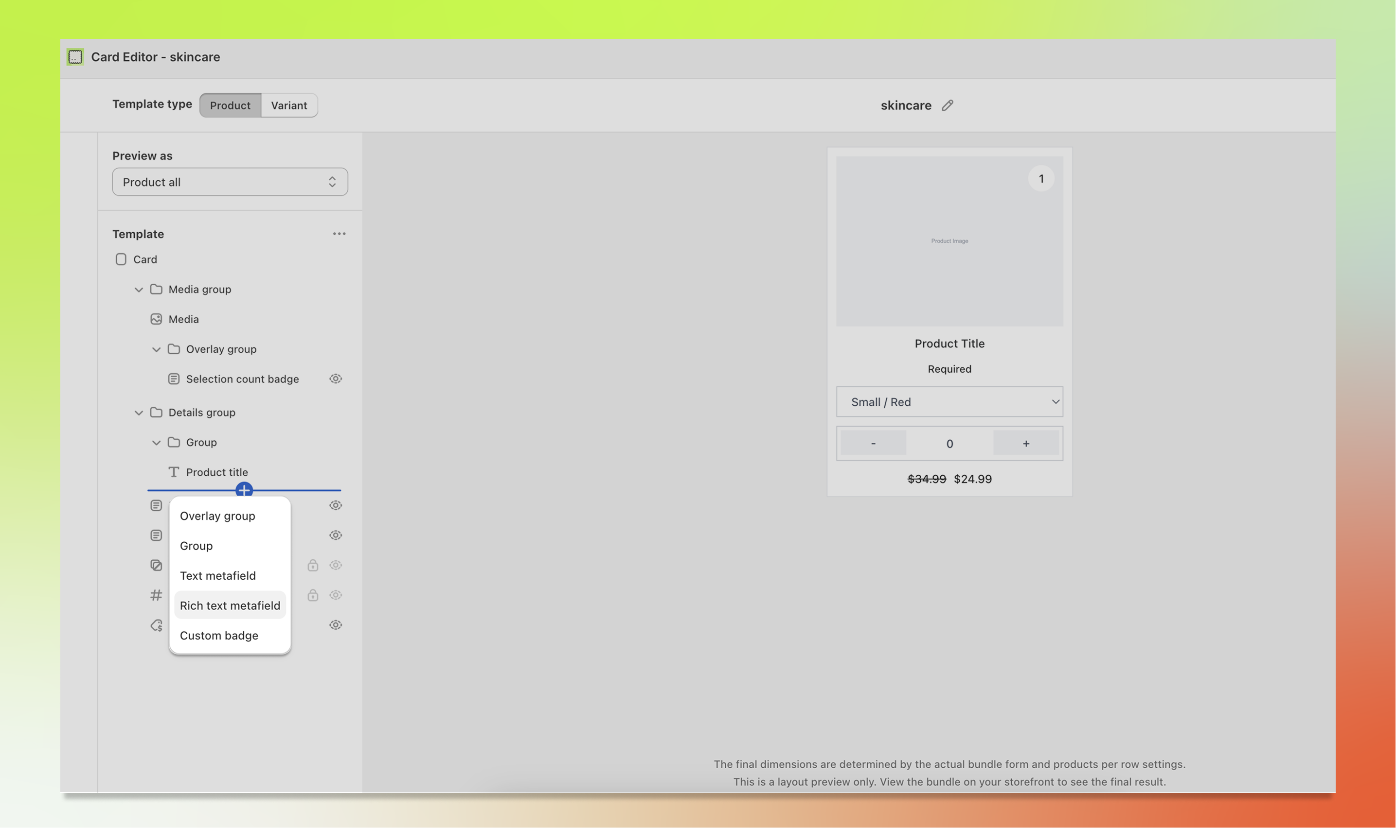
Components can be nested inside container components to create more complex layouts. There are four types of container components:
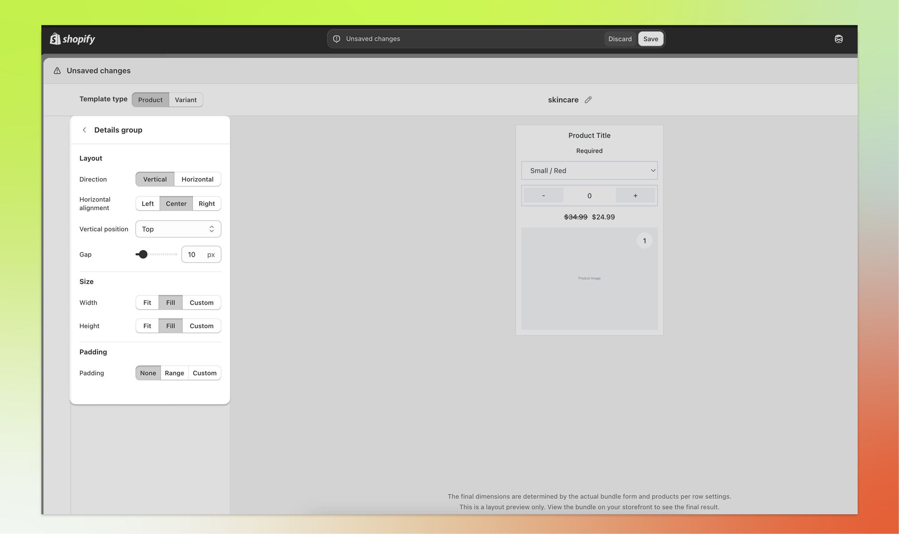
Group: A general-purpose container for organising multiple components together. You can control its direction (vertical or horizontal), alignment, and spacing.
Media group: A container specifically for media-related components. It gives you control over size and layout of media content.
Details group: A container for product detail components. Useful for grouping text, price, and other information together.
Overlay group: A special container that positions its children as an overlay on top of the media. This is useful for placing badges or labels in the corner of a product image.
To nest a component, drag it into a group in the tree, or click the "+" button inside a group to add a new child directly. Nesting is supported up to 8 levels deep.
Click any component in the tree to select it and show it's settings. The available settings vary depending on the component type, but here are the most common ones.
Available on container components such as Card, Group, and Media group.
Direction: Choose Vertical (components stacked top to bottom) or Horizontal (components placed side by side).
Horizontal alignment: Align child components to the Left, Center, Right, or distribute them with Space between.
Vertical position: Position child components at the Top, Middle, Bottom, or distribute them with Space between.
Gap: Set the spacing between child components, from 0 to 100 pixels.
Available on Media group, Details group, Group, and Overlay group.
Width: Choose Fit (shrinks to fit the content), Fill (expands to fill available space), or Custom (set a specific percentage).
Height: Same options as width: Fit, Fill, or Custom.
Available on most components.
None: No padding applied.
Range: Set individual padding values for top, bottom, left, and right using sliders.
Custom: Enter a custom CSS padding value for full control.
Available on content components such as Product title, Price, and badges.
Font size: Adjust the font size on a percentage scale from 80% to 180%.
Text alignment: Align text to the Left, Center, or Right.
Available on most components.
Hidden on: Choose None (always visible), Mobile (hidden on mobile devices), or Desktop (hidden on desktop). This is useful for creating responsive layouts where certain components only appear on specific screen sizes.
Available on the Media component.
Aspect ratio: Choose Adapt (uses the image's natural ratio), Portrait (4:5), Square (1:1), or Landscape (16:9).
Image fit: Choose Cover (fills the area, may crop) or Contain (fits the entire image within the area).
The Media component supports replacing the default product or variant image with an image stored in a metafield.
On Product templates, there are two options: "Replace product image" swaps the product image with a product metafield, and "Replace variant image" swaps the variant-specific image with a variant metafield. You can enable one or both.
On Variant templates, enable "Replace with metafield" to substitute the variant image with a variant metafield value.
When enabled, click the search button to browse and select the metafield namespace and key.
The metafield must be a file_reference type pointing to an image. The same appearance settings (aspect ratio and image fit) apply regardless of the image source.
The right panel of the editor shows a live preview of the layout that updates in real time as you make changes.
Use the desktop and mobile icons in the header to preview how your card looks on different screen sizes. This is especially helpful when you've used the "Hidden on" display setting to show different components on different devices.
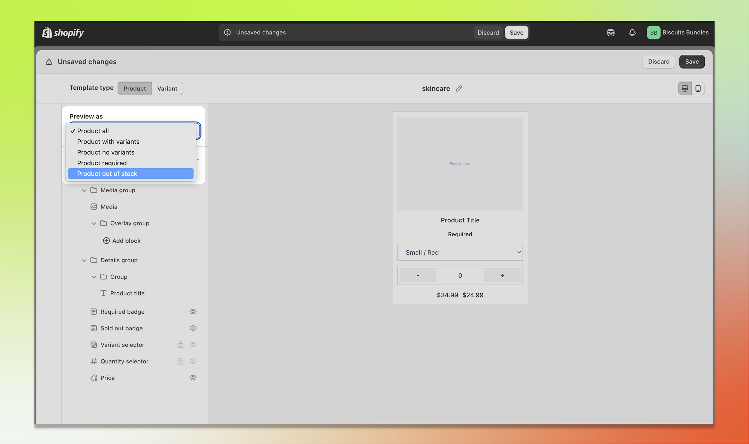
Use the preview context dropdown at the top of the component tree panel to preview your card in different states. This lets you see how conditional components look without having to set up real products.
The available preview contexts are:
Product all: Shows all conditional components at once, including the required badge and compare-at price.
Product with variants: A standard product card with a variant selector dropdown.
Product no variants: A product with only a default variant. The variant selector is hidden.
Product required: Shows the required badge on the card.
Product out of stock: Shows the sold out badge and the card appears faded.
Variant all: Shows all conditional components on a variant card.
Variant out of stock: A variant card in the out-of-stock state.
Variant required: A variant card with the required badge.
Variant with compare price: A variant card showing a compare-at price alongside the current price.
The preview uses sample data (such as "Example Product" and "$24.99") to simulate the storefront appearance.
When you make changes in the editor, a save bar appears at the top of the modal with two buttons:
Save template: Saves all your changes to the template. A success message will appear to confirm.
Discard and close: Discards all unsaved changes and closes the editor.
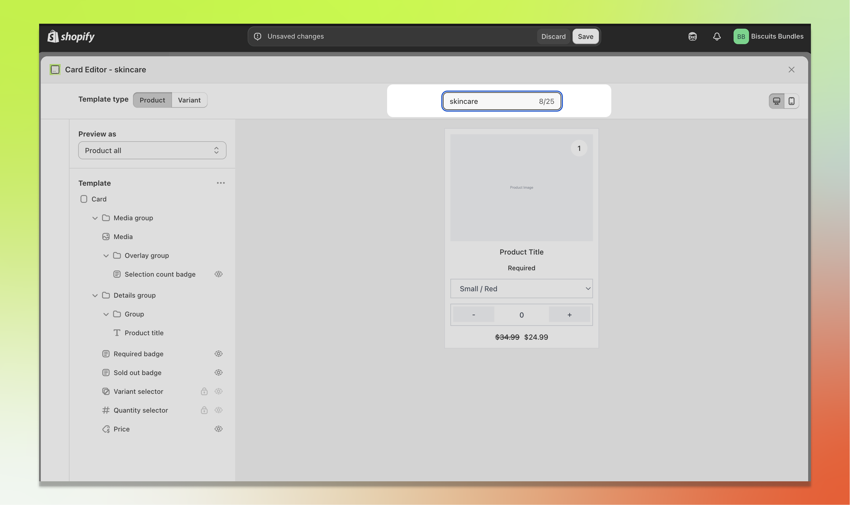
You can rename a template directly from the editor header, except for Default templates, which cannot be renamed.
Click the pencil/edit icon next to the template name, or double-click the template name.
Type your new name. The same rules apply as when creating a template: up to 25 characters, containing only letters, numbers, spaces, dashes, and underscores.
Press Enter to confirm the new name, or Escape to cancel.
To delete a template you no longer need:
Open the template selector dropdown.
Hover over the editable template you want to delete. A delete icon will appear on the right side.
Click the delete icon. A confirmation modal will appear.
Click Delete to confirm.
You can only delete templates that are not currently assigned to any bundle product.
If a template is assigned to one or more products, you'll need to edit those bundles and ressign them to a new template before you can delete the template.
The tooltip on the delete icon will let you know if the template is still in use.
Default templates cannot be deleted.
The Card Editor supports displaying Shopify metafield data directly on your product and variant cards. This is useful for showing custom information such as material, weight, origin country, or any other data stored in your product or variant metafields.
There are several ways to use metafields in the Card Editor:
Click the "+" button in the component tree and select Text metafield.
In the settings panel, choose whether the metafield should be read from the Product or the Variant.
Click the search button next to the namespace/key fields to browse and select from your existing metafield definitions.
The component supports a wide range of metafield types, including text, number, date, boolean, colour, weight, volume, dimension, and money.
This works the same way as the Text metafield component, but renders rich text content with formatting such as bold, italic, and lists. It only supports the rich_text_field metafield type.
Click the "+" button in the component tree and select Image metafield.
In the settings panel, choose whether the metafield should be read from the Product or the Variant.
Select whether the metafield holds a single image (One value) or multiple images (List of values). Only the first 10 images in a list will be displayed.
Click the search button next to the namespace/key fields to browse and select from your existing metafield definitions. The metafield must be a file_reference or list.file_reference type containing an image.
For lists, you can configure the direction (horizontal or vertical), items per row or column, gap between images, alignment, and height.
For single images, you can control the width (fit, fill, or a custom percentage).
Both modes support aspect ratio, image fit, padding, and responsive visibility settings.
You can replace the default product or variant title with a metafield value:
Select the Product title or Variant title component in the tree.
Enable "Replace with product/variant metafield" in the settings panel.
Select the metafield namespace and key. The title will now display the metafield value instead of the default product or variant name.
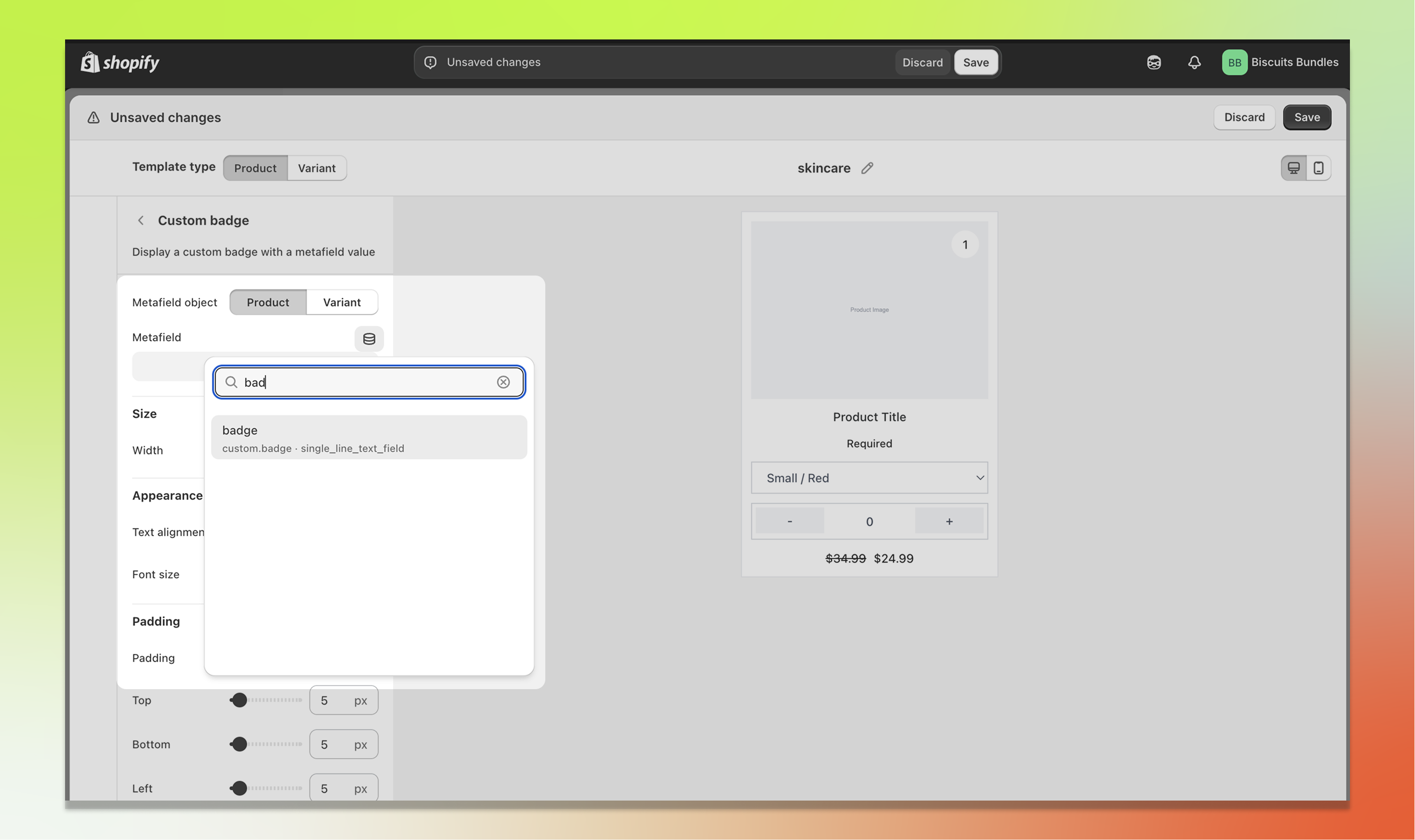
You can add a badge that displays a metafield value (e.g. "New", "Best Seller", "Organic"):
Click the "+" button and select Custom badge.
Choose the metafield source (Product or Variant).
Select the namespace and key for the metafield you want to display.
The badge will only appear on cards where that metafield has a value.
The Review Stars block shows a star rating on your product or variant card. It does not collect reviews, it only displays a rating that is already stored on the product or variant (for example, by a reviews app). For it to show anything, that rating value needs to exist first.
By default, the Review Stars block reads from Shopify's standardised reviews metafields (reviews.rating and reviews.rating_count), so if those are already populated on your products there is nothing else to set up. Prefer to use your own metafields? Tick Use custom metafields instead and choose them, but the rating must be a Rating type metafield and the review count must be an Integer type metafield.
Click the "+" button in the component tree and select Review stars. The block can be added to both Product and Variant card templates.
Choose the Metafield object. Product reads the rating from the product. Variant reads it from the currently selected variant.
Under Display options, toggle Show numeric rating (for example "4.5") and Show review count (for example "120 reviews").
On a Variant card, tick Fall back to product rating to use the product's rating and count when the selected variant doesn't have its own. This is the common setup, since most stores store ratings at the product level.
Tick Hide when no rating to hide the block completely on products or variants that have no rating yet.
Under Appearance, set the Star and text size (80-200%) and Text alignment (Left, Center, Right). The standard Padding and Hidden on (Mobile or Desktop) options work the same as on other blocks.
Good to know
Stars display on a 5-point scale and round to the nearest half star.
A screen-reader label announces the rating (for example "4.5 out of 5 stars, 120 reviews"). You can adjust its wording in the theme block's accessibility settings.
More info
Merchant setup: Adding standard metafield definitions (Shopify Help Center)
Standard definitions reference (incl. reviews.rating and reviews.rating_count): List of standard metafield definitions (shopify.dev)
Rating type detail (value, scale_min, scale_max): Liquid rating object (shopify.dev)
Q: I added the Review Stars block but no stars are showing. Why?
The block only displays a rating that already exists in a metafield. Check that your products have a value in the reviews.rating metafield (populated by a reviews app or import). Also confirm the Metafield object scope (Product vs Variant) matches where your rating is stored, and that Hide when no rating isn't hiding it on items without a rating. On variant cards, enable Fall back to product rating if your ratings live at the product level.
Q: Does Biscuits Bundles collect product reviews?
No. The Review Stars block displays an existing rating from a Shopify metafield. Use a reviews app that writes to the standardised reviews.rating / reviews.rating_count metafields, or map your own metafields via Use custom metafields instead.
Some components are required and must remain visible for the card to function correctly. For example, the Variant selector cannot be hidden on the product template. If you see this error, check which template has the issue (indicated in the header) and make sure all required components are enabled and visible.
You have a legacy template selected. Legacy templates (Portrait, Horizontal, Portrait compact, Horizontal compact) cannot be edited in the Card Editor. To use the editor, create a new editable template or select an existing editable template from the dropdown.
The template is currently assigned to one or more bundle products. You need to switch those bundle products to a different template before you can delete it. Default templates also cannot be deleted.
Template creation is limited by your plan. The counter in the template selector dropdown shows your current usage (e.g. "2/4"). To create more templates, either upgrade your plan or delete unused templates to free up a slot.
Card styling (colours, backgrounds, borders, shadows) is controlled in your Shopify theme editor under the Biscuits Bundle Builder block settings. The Card Editor only controls layout and component arrangement. See Customise the look of your bundle form for styling instructions.
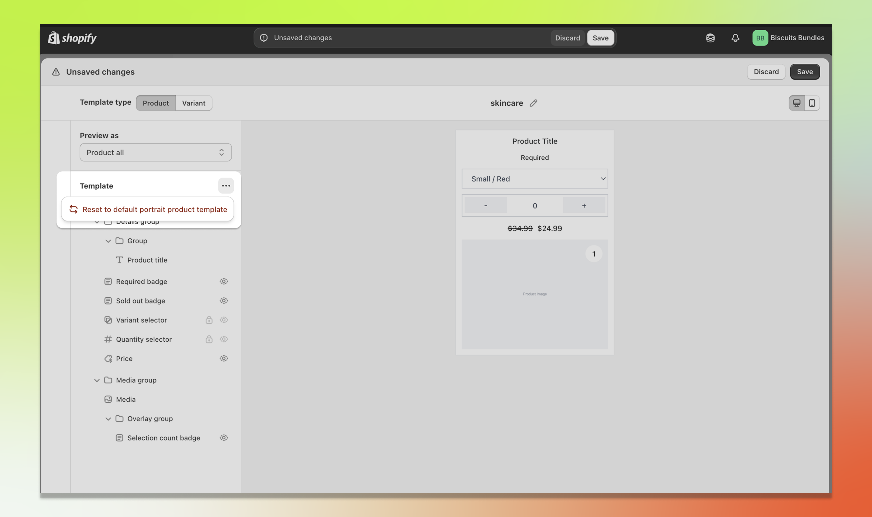
In the editor, click the three-dot menu (more options) at the top of the component tree panel and select Reset to default. This will reset the current template type (Product or Variant) back to its default layout. Your other template type will not be affected.