Biscuits Bundles frontend UI displaying products as swatches
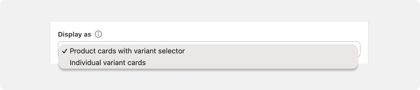
In this guide we will customise Biscuits Bundles App to display the components inside the Biscuits Bundle form like swatches. Components can be displayed as Product Cards or Variant Cards based on your settings inside the Bundle.
This guide is to effectively display the products a user can select as Swatch style cards. This guide will not adjust the variant selector of each product card to display options as swatches.
What this custom code will change:
Add custom css to change the look of a bundle step
Check if the step you want to display as swatches is displaying a variant or a product card. This is important as it will alter your custom CSS.
If you're displaying Variant cards follow these instructions:
If you're displaying Product cards follow these instructions:
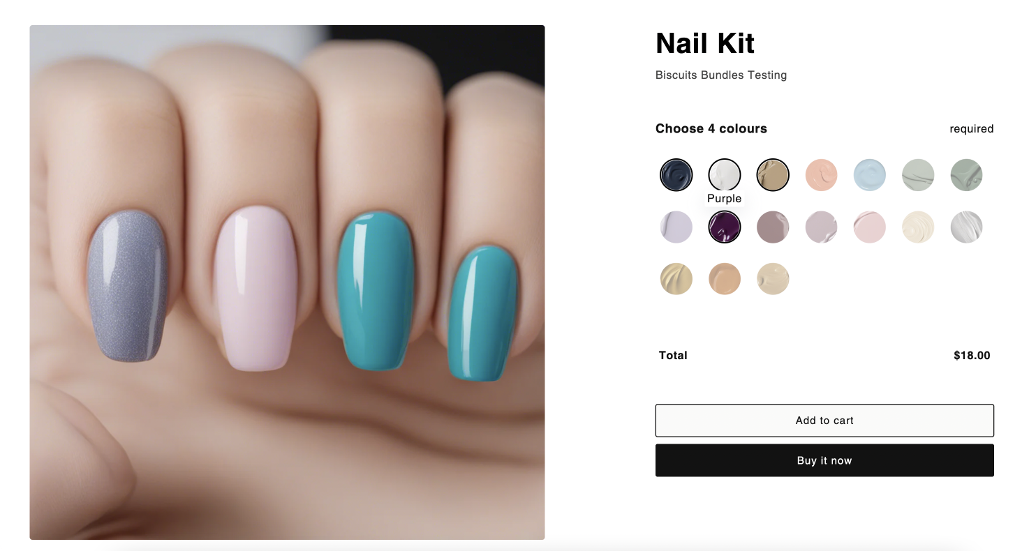
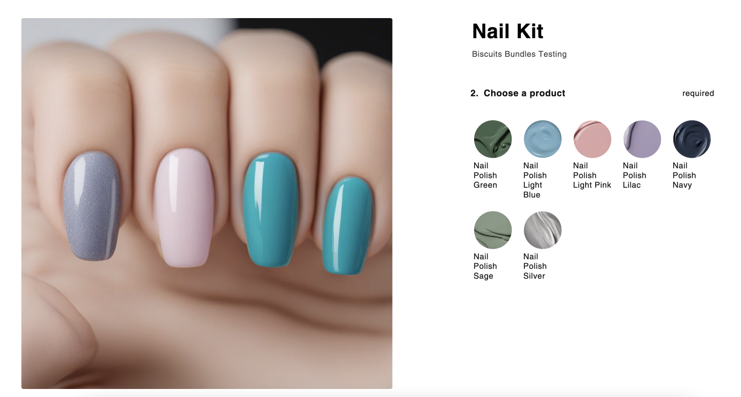
Beginning state we will customise to look like swatches
Your product initially looks like the above, with a product title and a variant title showing.
What we will need to change:
Hide product title
Display the variant title as a tooltip
Reduce the size of each item
Change the highlight state to outline the image only
Hide the Sold Out text and show a slash through the swatch instead
App block settings are template specific.
If you have multiple bundles and you need to set different Custom CSS on each bundle, you will need to create a product template for each bundle.
To match the beginning state above, you will need to make sure your bundle step matches the following settings.
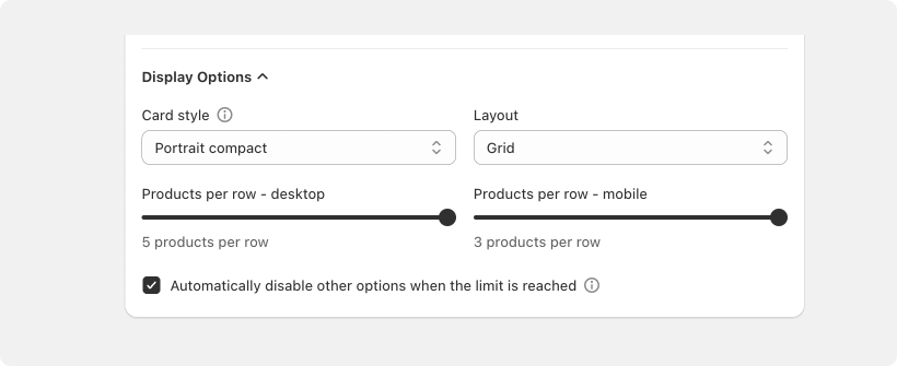
Card style: portrait compact
Layout: grid
Products per row desktop: 5 (we can increase this in the custom css)
Products per row mobile: 3 (we can increase this in the custom css)
The below code completes all these changes for you, we just need to configure the settings at the top of the custom css.
CUSTOM CSS CODE - VARIANT CARD
/* Step Settings*/
[data-biscuits-step="1"].biscuits-bundle-step .biscuits-bundle-step__products {
--biscuits-column-mobile: 25% !important;
--biscuits-column-desktop: 14.28% !important;
}
/* End Step Settings*/


[data-biscuits-step="1"].biscuits-bundle-step .biscuits-bundle-item__variant-title {
    position: absolute;
    bottom: 100%;
    left: 50%;
    transform: translate(-50%, 1rem);
    background: white;
    border-radius: 2px;
    z-index: 2;
    padding: 0.25rem !important;
    opacity: 0 !important;
    width: auto;
    text-align: center;
    visibility: hidden;
    box-shadow: rgba(149, 157, 165, 0.2) 0px 8px 24px;
    transition: opacity 0.5s ease, visibility 0.5s ease,transform 0.5s ease;
}

[data-biscuits-step="1"].biscuits-bundle-step .biscuits-bundle-item-card:hover .biscuits-bundle-item__variant-title {
    opacity: 1 !important;
    visibility: visible !important;
   transform: translate(-50%,0);
    transition: opacity 0.5s ease, visibility 0.5s ease,transform 0.5s ease;
}

[data-biscuits-step="1"].biscuits-bundle-step .biscuits-bundle-item-card {
    position: relative;
}

[data-biscuits-step="1"].biscuits-bundle-step .biscuits-bundle-item__title {
    position: initial !important;
}

[data-biscuits-step="1"].biscuits-bundle-step .biscuits-bundle-item__details {
    position: initial !important;
    margin: 0;
    height: 0;
}

[data-biscuits-step="1"].biscuits-bundle-step .biscuits-bundle-item__product-title {
  display: none !important;
}

[data-biscuits-step="1"].biscuits-bundle-step .biscuits-bundle-item__image {
  border-radius: 100%;
}

[data-biscuits-step="1"].biscuits-bundle-step .biscuits--active .biscuits-bundle-item__image {
  border: 2px solid rgba(0,0,0,0);
}

[data-biscuits-step="1"].biscuits-bundle-step .biscuits--active .biscuits-bundle-item__image {
  border: 2px solid black;
}

[data-biscuits-step="1"] [data-biscuits-available="false"] .biscuits-bundle-item__container {
  cursor: not-allowed;
}

[data-biscuits-step="1"] .biscuits-bundle-badge--soldout {
  display: none;
}

[data-biscuits-step="1"] [data-biscuits-available="false"] .biscuits-bundle-item__image::after {
  width: 4px;
  background: white;
  height: 100%;
  position: absolute;
  top: 50%;
  left: 50%;
  content: '';
  transform: rotate(45deg) translate(-50%, -50%);
  transform-origin: 0 0;
}
1. Copy the above code to edit
jsbin is a great free online page you could copy paste into for ease of use.
Alternatively paste straight into the custom css field in your biscuits bundle app block. (not our first option as their field is tiny and not very code editing friendly)
2. Set your step [data-biscuits-step="1"]
Update all instances of [data-biscuits-step="1"] to your matching step number. If you want step 2 to display like swatches, change the 1 to a 2
This guide only demonstrates how to make one step look like swatches. To update more than one step you will need to repeat all steps and paste your second code below your first in custom CSS app block field.
3. Update --biscuits-column-mobile and --biscuits-column-desktop
Depending on how many items you want per row, divide 100% by that number and set the width of the desktop and mobile items accordingly. i.e The example code will display 4 items across on mobile, and 7 on desktop.
4. Paste your edited code into the custom css field in the biscuits bundle app block
If you need help finding where this is follow this guide.
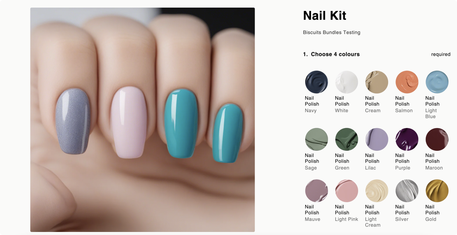
Beginning state we will customise to look like swatches
Your product initially looks like the above, with only product title.
What we will need to change:
Display the product title as a tooltip
Reduce the size of each item
Change the highlight state to outline the image only
Hide the Sold Out text and show a slash through the swatch instead
App block settings are template specific.
If you have multiple bundles and you need to set different Custom CSS on each bundle, you will need to create a product template for each bundle.
💡 Tip: To keep your tooltips short, you will need to update your product titles to not include i.e "Nail Polish"
To match the beginning state above, you will need to make sure your bundle step matches the following settings.

Card style: portrait compact
Layout: grid
Products per row desktop: 5 (we can increase this in the custom css)
Products per row mobile: 3 (we can increase this in the custom css)
The below code completes all these changes for you, we just need to configure the settings at the top of the custom css.
CUSTOM CSS CODE - PRODUCT CARD
/* Step Settings*/
[data-biscuits-step="1"].biscuits-bundle-step .biscuits-bundle-step__products {
--biscuits-column-mobile: 25% !important;
--biscuits-column-desktop: 14.28% !important;
}
/* End Step Settings*/


[data-biscuits-step="1"].biscuits-bundle-step .biscuits-bundle-item__title {
    position: absolute;
    bottom: 100%;
    left: 50%;
    transform: translate(-50%, 1rem);
    background: white;
    border-radius: 2px;
    z-index: 2;
    padding: 0.25rem !important;
    opacity: 0 !important;
    width: auto;
    text-align: center;
    visibility: hidden;
    box-shadow: rgba(149, 157, 165, 0.2) 0px 8px 24px;
    transition: opacity 0.5s ease, visibility 0.5s ease,transform 0.5s ease;
}

[data-biscuits-step="1"].biscuits-bundle-step .biscuits-bundle-item-card:hover .biscuits-bundle-item__title {
    opacity: 1 !important;
    visibility: visible !important;
    transform: translate(-50%,0);
    transition: opacity 0.5s ease, visibility 0.5s ease,transform 0.5s ease;
}

[data-biscuits-step="1"].biscuits-bundle-step .biscuits-bundle-item-card {
    position: relative;
}

[data-biscuits-step="1"].biscuits-bundle-step .biscuits-bundle-item__details {
    position: initial !important;
    margin: 0;
    height: 0;
}

[data-biscuits-step="1"].biscuits-bundle-step .biscuits-bundle-item__product-title {
  display: none !important;
}

[data-biscuits-step="1"].biscuits-bundle-step .biscuits-bundle-item__image {
  border-radius: 100%;
}

[data-biscuits-step="1"].biscuits-bundle-step .biscuits--active .biscuits-bundle-item__image {
  border: 2px solid rgba(0,0,0,0);
}

[data-biscuits-step="1"].biscuits-bundle-step .biscuits--active .biscuits-bundle-item__image {
  border: 2px solid black;
}

[data-biscuits-step="1"] [data-biscuits-available="false"] .biscuits-bundle-item__container {
  cursor: not-allowed;
}

[data-biscuits-step="1"] .biscuits-bundle-badge--soldout {
  display: none;
}

[data-biscuits-step="1"] [data-biscuits-available="false"] .biscuits-bundle-item__image::after {
  width: 4px;
  background: white;
  height: 100%;
  position: absolute;
  top: 50%;
  left: 50%;
  content: '';
  transform: rotate(45deg) translate(-50%, -50%);
  transform-origin: 0 0;
}
1. Copy the above code to edit
jsbin is a great free online page you could copy paste into for ease of use.
Alternatively paste straight into the custom css field in your biscuits bundle app block. (not our first option as their field is tiny and not very code editing friendly)
2. Set your step [data-biscuits-step="1"]
Update all instances of [data-biscuits-step="1"] to your matching step number. If you want step 2 to display like swatches, change the 1 to a 2
This guide only demonstrates how to make one step look like swatches. To update more than one step you will need to repeat all steps and paste your second code below your first in the app block.
3. Update --biscuits-column-mobile and --biscuits-column-desktop
Depending on how many items you want per row, divide 100% by that number and set the width of the desktop and mobile items accordingly. i.e The example code will display 4 items across on mobile, and 7 on desktop.
If you product titles are quite long you can add a min-width: 100px to .biscuits-bundle-item__title to ensure the text isn't forced in the the size of the grid item.
4. Paste your edited code into the custom css field in the biscuits bundle app block
If you need help finding where this is follow this guide
Always thoroughly test your custom CSS to ensure it behaves as expected across all supported browsers and devices.
Stuck or got questions?
Use the chat widget below, or reach out to us at [email protected]
Happy coding, and thanks for teaming up with Biscuits Bundles!