The following customisations require adding css code to your custom css field your Biscuits Bundle app block. If you haven't already, check out the guide for how to edit the custom css field in your Biscuits Bundle app block.
How to edit custom CSS
Customisations are template specific
All bundle products that use this template will inherit the same styling. If you need a customisation to apply to just one bundle, create a dedicated template for that bundle.
Set a fixed width and shape for each summary tile (square, portrait, landscape) and adjust spacing. --biscuits-accordion-grid-gap controls the spacing between tiles. Larger values = more space.
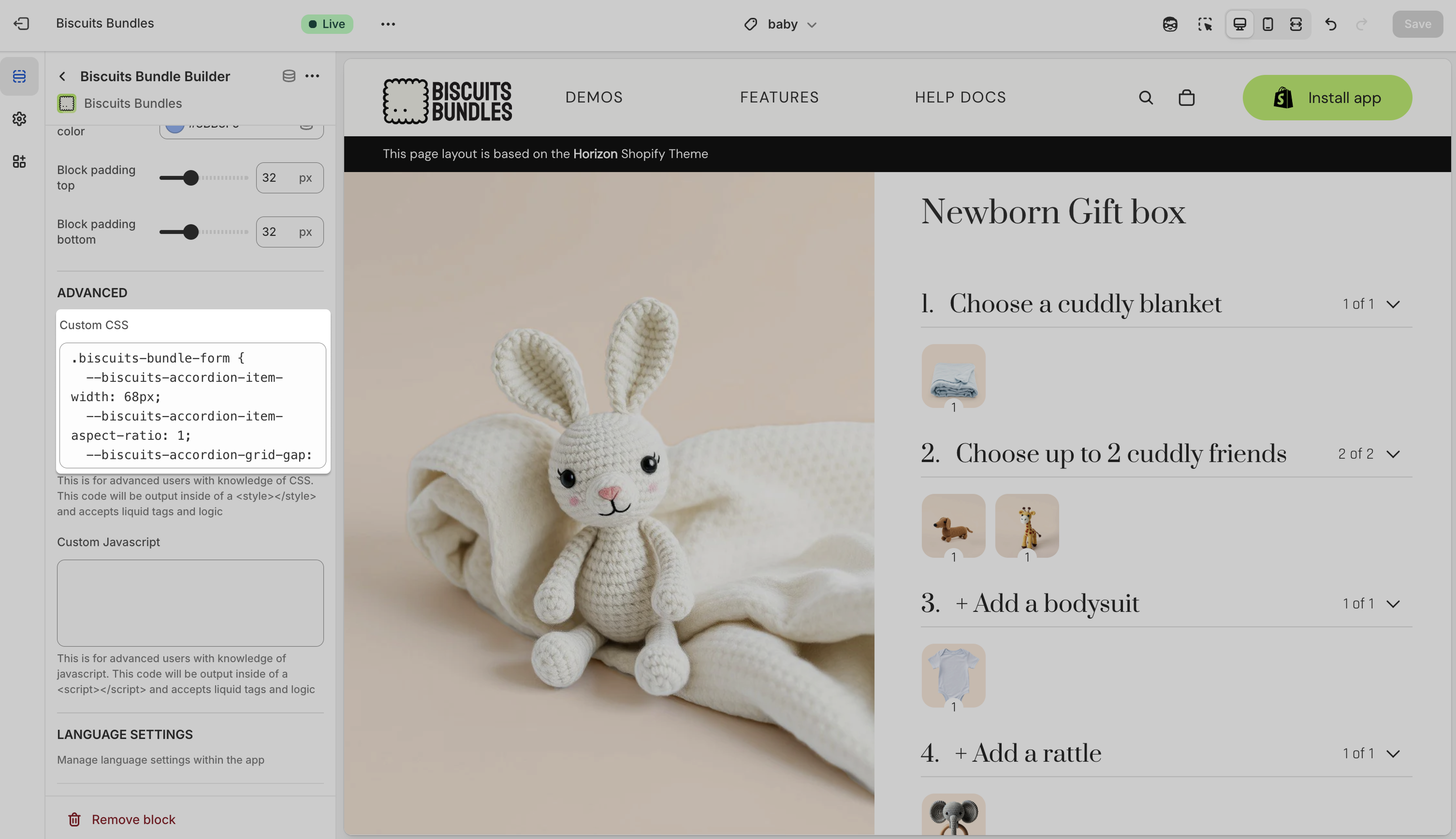
.biscuits-bundle-form {
  --biscuits-accordion-item-width: 100px;
  --biscuits-accordion-item-aspect-ratio: 1;
  --biscuits-accordion-grid-gap: 8px;
}
Tips
Square: 1
Portrait: 0.75 (taller than wide)
Landscape: 1.6 (wider than tall)
Hide the icon and show the numeric counter.
.biscuits-bundle-form {
  --biscuits-accordion-summary-icon-display: none; /* hide + icon */
  --biscuits-accordion-summary-count-display: block; /* show number */
}
Note: If both icon-display and count-display are set to block, they’ll overlap. Choose one based on your design preference.
Enable the display of the steps total price in the summary/step header.
.biscuits-bundle-form {
  --biscuits-accordion-summary-price-display: block;
}Set RGBA channel values as r,g,b,a (not rgba()), and the app will render them correctly.
Placeholder summary item
.biscuits-bundle-form {
  --biscuits-accordion-progress-background-color: 0,0,0,0;
  --biscuits-accordion-progress-border-color: 225,225,225,1.0;
}
Selected/filled summary item
.biscuits-bundle-form {
  --biscuits-accordion-success-background-color: 0,0,0,0;
  --biscuits-accordion-success-border-color: 225,225,225,1.0;
}
Count badge + page chrome
.biscuits-bundle-form {
  --biscuits-accordion-page-background-color: 255,255,255,1.0;
  --biscuits-accordion-text-color: 0,0,0,1.0;
}Match your theme’s radius and border thickness, or set explicit values.
.biscuits-bundle-form {
  --biscuits-accordion-item-border-radius: 6px;
  --biscuits-accordion-primary-border-thickness: 2px;
}
Stuck or got questions?
Use the chat widget below, or reach out to us at [email protected]
Happy coding, and thanks for teaming up with Biscuits Bundles!